Calibrated Democracy
The intersection of data and ‘there has to be a better way‘.
I’m an expert in failure – literally. For 17 years, I was a metallurgist studying why things failed and how to fix them. Physical items, sure, but also processes and procedures. Identifying problems, sometimes ones you don’t even realize you have, and finding ways to improve your workflow come naturally to me.
I quit metallurgy to save the world. It’s a work in progress.
I build tools and workflows that make organizers’ lives easier. Usually with data, sometimes with kitchen utensils.
Here are a few examples of solutions for people who just needed a better way.
The rent is too damn high.
As a data specialist at a labor union, I can confirm. Join a union, folks.
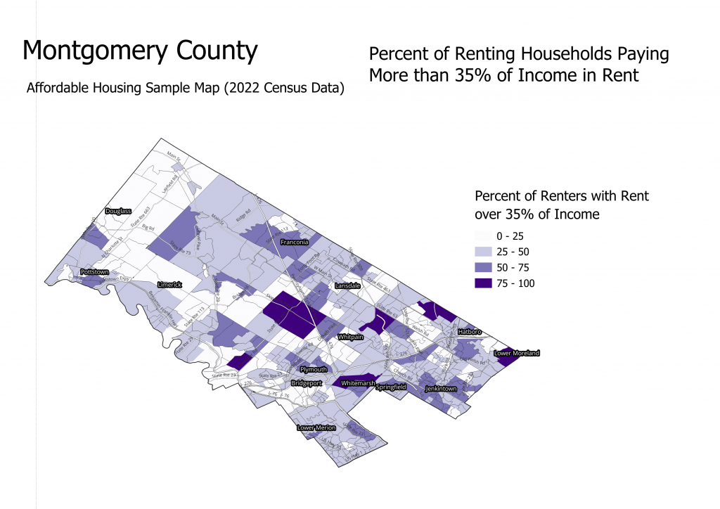
Your values don’t change, but the conversations can. Layering census data over your canvasing turfs can help guide how your conversations start.
Why are you still counting lit for walk packets?
Your volunteers will love you for this, guaranteed.
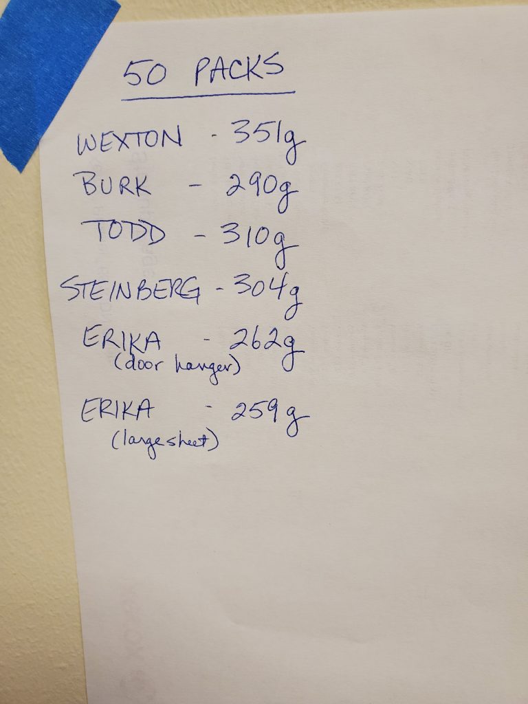
A kitchen scale can count them for you.
While you’re at it, manage your staging locations and turf assignments.
“Best Data Director I’ve ever gotten to work with, seriously.”
– Our GOTV coordinator after I debuted this program for a federal campaign.
A process to distribute turf assignments during large canvass events.
Experienced volunteers scan a QR code, which sends a text to the staging location lead. If the volunteer’s phone number is in the system, an organizer can respond with a prefilled text with the next list number in the priority queue automatically added. The volunteer and list number are logged in a spreadsheet. They can then grab a lit packet from the table and head out.
Keep the focus where you need it.
It’s this kind of mindset that earned me a personal shout-out at a Bernie Sanders rally.
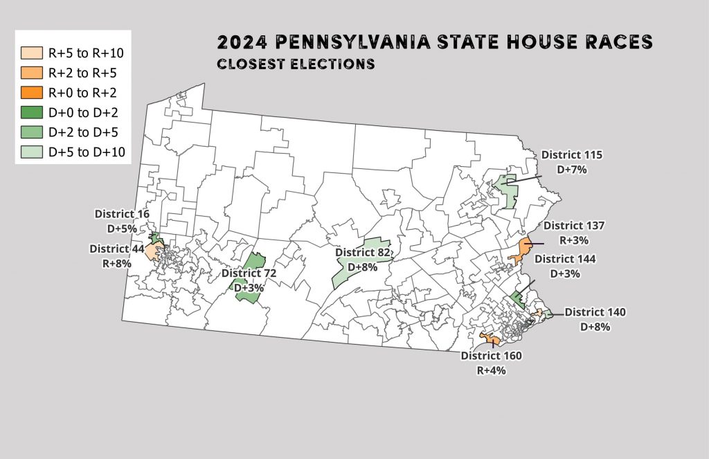
Many traditional maps of election results highlight races where the margins were highest. Focusing on districts with close races can demonstrate where resources may be most helpful to either flip or defend a seat.
The colors are changed from red/blue to interrupt the subconscious thought that more intense colors represent higher margins.
Game nights.
A local company, Improv Your Life 24-7, runs game nights. Managing the events both before and during became an exercise in unnecessary record-keeping. A mobile app to keep track of games, players, and scores keeps the focus on the fun.
(disclosure, I am the Assistant Director/Creative Consultant for IYL and engaged to the Chief Entertainment Officer).
Sometimes even the best solutions don’t work.
The power button only turned her off for 10 minutes.
“Pooh felt that he ought to say something helpful about it, but didn’t quite know what. So he decided to do something helpful instead.”
Winnie-the-Pooh by A.A. Milne
Have an interesting problem or a messy spreadsheet? I’d love to hear about it: